Welcome to Climbuddy
Climbuddy is a mobile and wearable app designed for the climbing community. It enables climbers to find partners at their skill level, book certified coaches, discover nearby climbing venues, and track their performance using wearable devices.
Our Team

Rui Zheng
ID: 2362065
Hangzhou. Chief Last-Minute Expert. Looks calm, panics internally.

Jiutian Chang
ID: 2362412
Libra ⚖️ | Chief Overthinking Officer. Powered by curiosity and an endless debate between "this one" or "that one".

Zhixian Zhou
ID: 2360690
Leo 🦁 | Chief Late-Night Officer. Powered by pure curiosity and chronic sleep deprivation.

Xinyi Xiao
ID: 2363303
Chief Anxiety Officer (CAO), Janja Garnbret self-shipper.
The Why
We chose the Active track because climbing is one of the fastest-growing urban sports in China, yet its digital support remains fragmented and socially isolating. Unlike conventional gym workouts, climbing inherently requires a partner — for safety, motivation, and progression — but no dedicated platform bridges partner-matching, gym discovery, coaching, and progress tracking in one connected experience.
Our team observed that climbers routinely juggle four or five separate tools: WeChat groups for finding partners, Xiaohongshu for gym reviews, Dianping for pricing, a coach's personal WeChat for bookings, and a generic fitness app for logging. This friction discourages beginners from continuing and limits experienced climbers from reaching their potential. The sport's social, skill-based, and progressive nature makes it uniquely suited for a playful digital companion.
Research on climbing technology has also increased in recent years, including movement analysis, training feedback, and technical support [1–3]. However, these advances remain inaccessible to everyday users. Climbuddy addresses this gap by integrating partner matching, a verified gym directory, certified coach bookings, and wearable-powered performance tracking into a single, low-friction app. Our two core aims: an Integrated Climbing Flow that removes fragmentation, and a Low-Pressure Playful Experience that keeps users motivated through gamified milestones and community recognition.
The Gap
Academic Papers
Addressing Grading Bias in Rock Climbing: Machine and Deep Learning Approaches — O'Mara & Mahmud, 2025
Did Well
- Applied AI/ML to reduce subjectivity in route grading
- Dataset-driven approach with measurable benchmark results
- Bridges sports science and HCI through computational modelling
Missed
- No user-facing application or interface designed for climbers
- Ignores social and partner-matching aspects of the sport
- Findings inaccessible to everyday beginners
ClimbingCap: Multi-Modal Dataset for Rock Climbing in World Coordinate — Yan et al., 2025
Did Well
- Multi-modal sensing (RGB, depth, IMU) captures body movement
- World-coordinate mapping enables precise motion analysis
- Strong technical foundation for future performance tools
Missed
- No consumer-facing app or UX layer for real-world use
- Requires specialised lab hardware, not wearable-ready
- No coaching recommendations or feedback loop for users
Sound-Assisted Climbing: Bouldering Performance Through Auditory Guidance — Sun et al., 2025
Did Well
- Novel sensory-feedback modality proven to improve performance
- Conducted rigorous user testing with real climbers
- Demonstrates technology can directly aid training on the wall
Missed
- Narrows scope to audio only — no visual or haptic integration
- No social or community dimension explored
- Lab-based setup; limited real gym deployment
Gamification in Fitness Apps: Effects on Motivation and Retention — Lister et al., 2014
Did Well
- Empirically links badge/leaderboard mechanics to sustained engagement
- User-centred methodology with broad fitness domain coverage
- Provides design principles directly applicable to activity apps
Missed
- General fitness focus — no sport-specific (climbing) context
- Does not address partner or coach discovery flows
- Long-term retention evidence remains limited
Commercial Products
Xiaohongshu (小红书)
Did Well
- Massive user base with rich photo/video gym reviews
- Strong community feel with comments and saves
- Effective for visual discovery and trend-driven content
Missed
- No climbing-specific filters (difficulty level, beginner-friendliness)
- Heavily influenced by promotional/sponsored content
- No partner-matching or coach-booking functionality
Dianping (大众点评)
Did Well
- Location-based gym search with map integration
- Aggregated star ratings and user text reviews
- Shows pricing and opening hours reliably
Missed
- Generic platform — no climbing-specific metadata (route setter, V-grade range)
- Reviews often vague and ad-polluted without climbing expertise
- No social layer for partner finding or progress sharing
WeChat Groups (微信群)
Did Well
- Familiar interface with high daily engagement
- Real-time coordination among trusted contacts
- Low barrier to entry — no new app required
Missed
- No structured matching by skill level or availability
- No profile verification or trust signals for strangers
- No progress tracking, coaching, or gym discovery features
8a.nu / TheCrag
Did Well
- Comprehensive global route database with community grading
- Personal logbook for tracking ascents and progression over time
- Established trust within the serious climbing community
Missed
- English-only UI — poor accessibility for Chinese domestic market
- No indoor gym directory or coach-booking integration
- No social partner-matching or beginner onboarding
Requirements Discovery
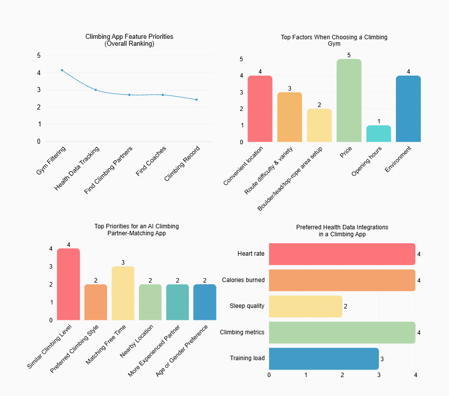
We combined an offline questionnaire with semi-structured interviews to understand the needs of climbers at different experience levels, including beginners, intermediate climbers, and coach-related users.
Through these sessions with 7 participants, we identified key feature priorities, factors influencing gym selection, preferred health data integrations, and insights for AI-powered partner matching functionality.
User Personas
Image generated via Doubao
A newcomer seeking partners and structured learning to build confidence
Age: 18–25
Work: University Student
Location: China (university gym)
Climbing Level: Complete Beginner
Personality
Goals
- Find a partner of similar age and gender to climb with regularly
- Get structured guidance on safety and beginner technique (fall protection, muscle strengthening)
- Book a coach to establish proper fundamentals from the start
- Discover gyms that offer routes suited to all levels, especially beginners
- Learn in a flexible, self-paced way rather than relying on fixed club schedules
Frustrations
- Too shy to approach strangers at the gym; friends' schedules rarely align
- Has never booked a coach — process feels unclear and inaccessible
- Gym discovery relies on word-of-mouth, which is incomplete and inconsistent
- No climbing apps or wearables used — starting entirely from scratch
Bio
Emma just discovered climbing through her university gym. She goes less than once a week, mostly because she doesn't know anyone to climb with — she's too shy to approach strangers and her friends' schedules rarely match hers. She has a strong desire to find a same-age, same-gender partner and is extremely open to coaching, though she's never booked a session before. She finds current gym info channels unsatisfying and has never used any climbing-related app or wearable. With Climbuddy, Emma can find a compatible partner, book a beginner coach directly, and access safety tips and muscle-training guides — all in one place, on her own schedule.
An experienced climber and part-time coach who values route quality and community trust
Age: 18–25
Work: Part-time Climbing Coach
Location: Shanghai / Suzhou, China
Climbing Level: Advanced (~2 years)
Personality
Goals
- Access detailed, authentic gym info — route setter background, gym style, actual layout
- Discover quality gyms when travelling between Shanghai and Suzhou
- Share route videos and gym experiences within the climbing community
- Provide guidance to newcomers without managing complex logistics
Frustrations
- Review platforms (Xiaohongshu(小红书), Dazhong Dianping(大众点评)) are full of ads or too vague — no per-gym star ratings
- Gym style and route quality can only be assessed through climber word-of-mouth
- No platform centralises gym search and honest community reviews in one place
Bio
Marcus has been climbing for nearly two years, primarily bouldering indoors across Shanghai and Suzhou. He holds a government-issued instructor certificate and informally coaches club newcomers. He is frustrated by how scattered and promotion-heavy gym information is online — real knowledge only travels through the climbing community. He rarely needs partner-matching as he prefers to climb solo, but cares deeply about route setter identity, venue style, and area size before committing to a new gym. With Climbuddy, Marcus can browse verified gym profiles with community ratings and contribute his expertise to help others discover quality venues.
User Journey Map
The journey map below traces our primary persona Emma's experience across five stages — Discovery, Exploration, Socializing, Reflection, and Growth — capturing her touchpoints, actions, pain points, emotional curve, and the design opportunities each stage reveals.

How ClimBuddy responds at each stage — the design decisions we made, and why.
"Emma is anxious about climbing as a new hobby — she doesn't know where to start or whether the app is for someone like her."
The first screen shows an illustrated guide to climbing basics (safety, grip types, V-grade system) alongside a "Find Your First Partner" prompt — no feature walls, just clear next steps for someone starting from zero.
"Emma had to cross-reference Dianping, Xiaohongshu, and WeChat just to evaluate one gym."
Each gym card surfaces what climbers actually decide on — V-grade range, beginner-friendliness score, route setter profile, and all-in price. Filter by proximity, level, and coach availability.
"The real barrier wasn't finding partners — it was trusting strangers enough to show up."
Partners are pre-filtered by skill level and shared free time, then revealed one card at a time via swipe. A credit score built from punctuality and peer feedback makes reliability visible without public shaming.
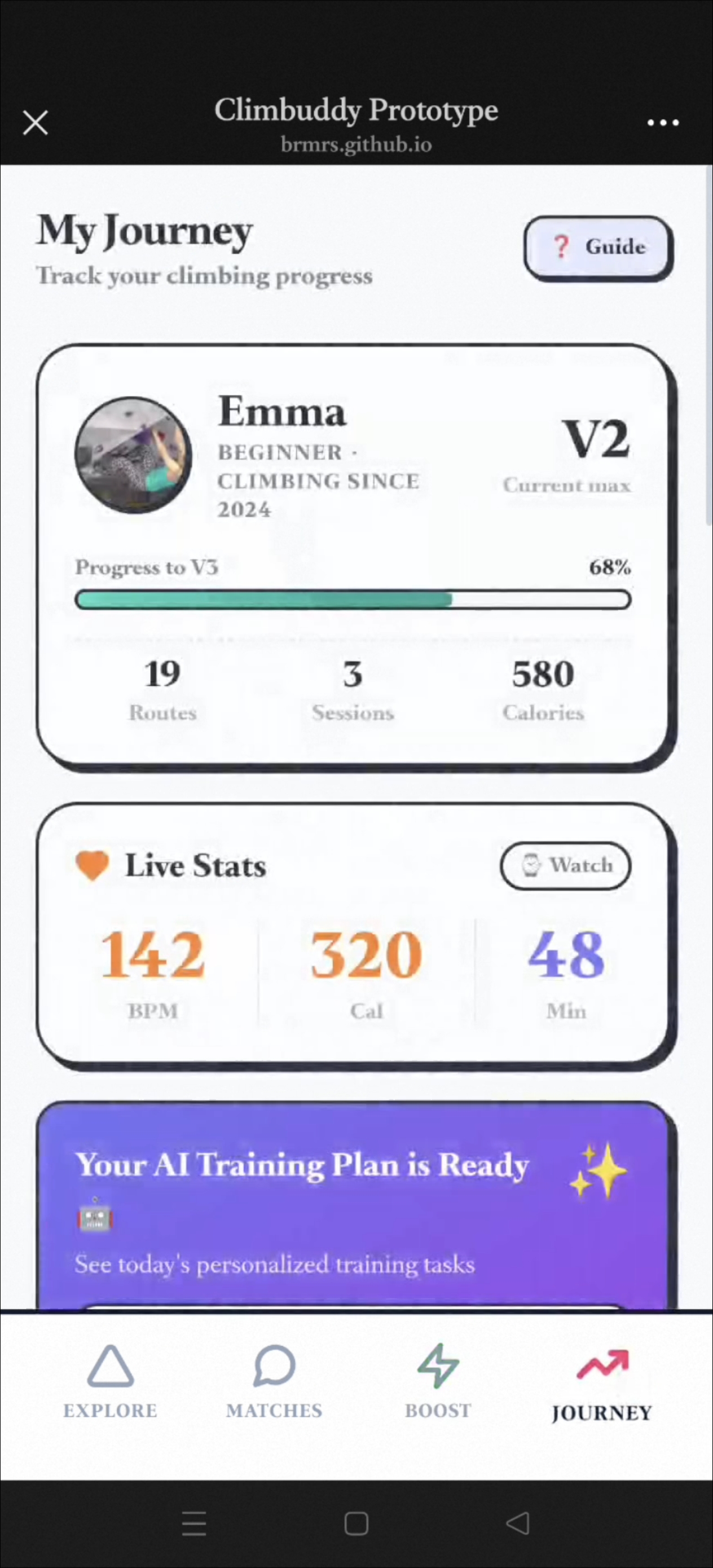
"Emma could feel herself improving but had no way to measure or articulate it."
After each session Emma uploads a route video. The AI Coach annotates posture, flags foot placement, and suggests one drillable focus. Wearable data (heart rate, grip effort) adds objective context.
"Progress felt invisible — there was nothing to show for weeks of effort."
Each verified V-grade unlock earns a shareable badge on Emma's public profile and the community feed. Certifications are tiered (Beginner → Intermediate → Advanced) for sustained long-term goals.
Requirements List
Three must-haves derived from user research, each defining how ClimBuddy must satisfy its core needs while remaining "Playful".
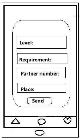
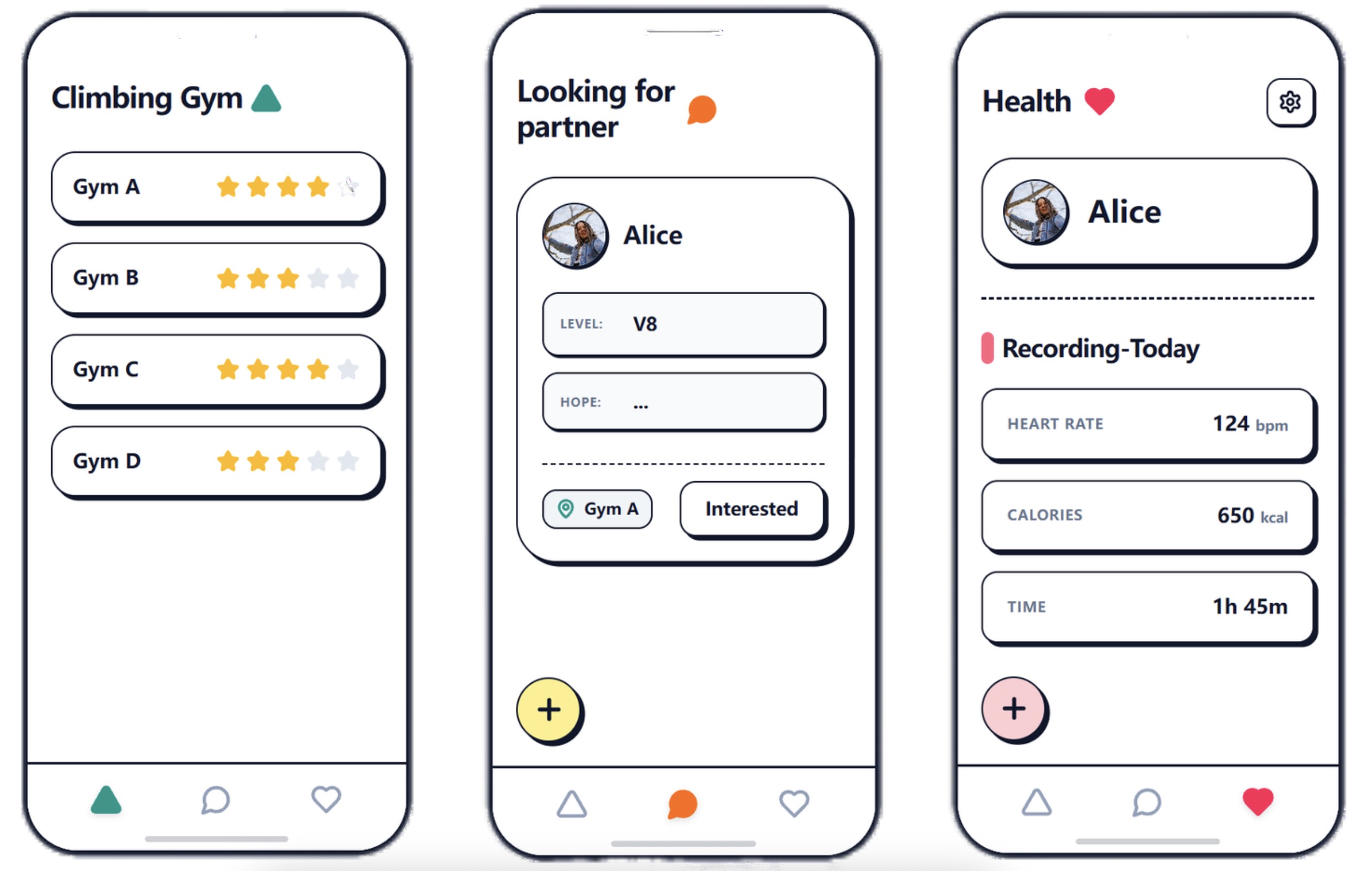
- User Need: Better Partner Matching Skill-Matched, Schedule-Aware Partner Discovery Users value meeting climbers at a similar level with overlapping free time — not just proximity. The system must filter partners by V-grade range and weekly availability, then surface them through a swipe-card interface that turns a logistical chore into a low-pressure, playful decision. A credit-score layer makes trust-building feel like a reputation game, not a background check.
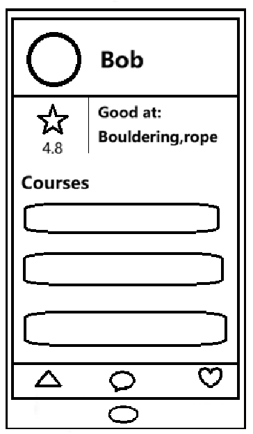
- User Need: Clearer Gym Information Structured, Comparable Gym Cards Users decide on gyms based on price, distance, and environment — but existing platforms bury this behind ads or vague reviews. Every gym card must expose these three anchors as scannable, comparable fields (not free text), alongside a beginner-friendliness score and route setter profile. This turns gym discovery from a research task into an exploratory browse — inherently more playful.
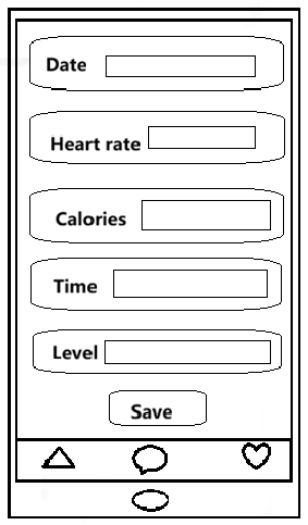
- User Need: More Connected Training Flow Closed-Loop Progress Feedback Users want training data, content, and feedback to be connected — not siloed across a wearable app, a coach's WeChat, and a generic log. The system must link each climbing session (wearable data + video upload) to an AI Coach response, which in turn unlocks the next V-level milestone badge. This closed loop makes progress feel like a game progression system, sustaining motivation across sessions.
Evidence of Life
Documentation of our team conducting interviews and observations with potential users at climbing sites.
Interview Scheduling
Initial contact and time coordination with a potential user to arrange the interview session.
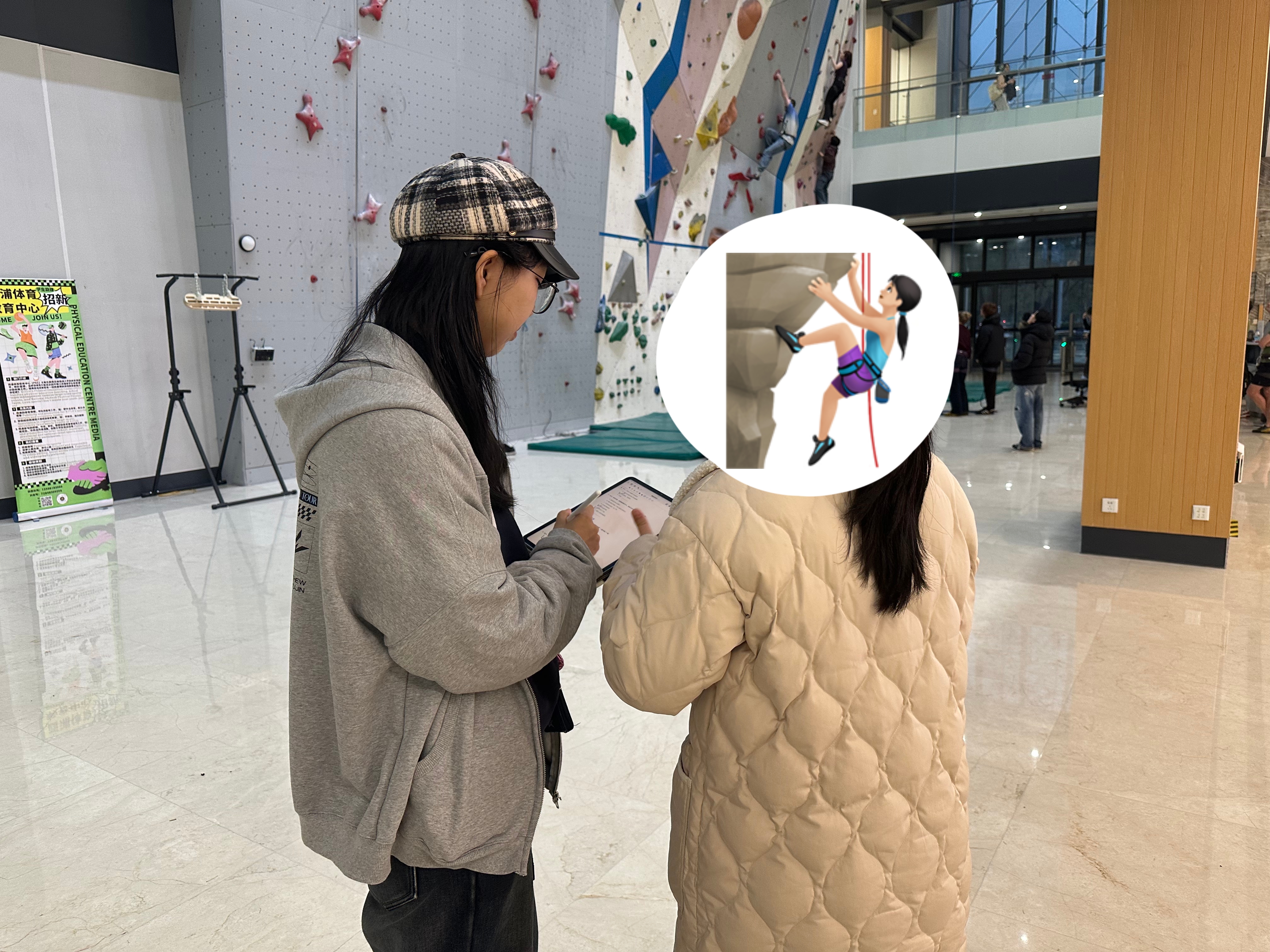
On-Site Interview
Conducting face-to-face interview at the climbing gym to gather firsthand insights about user needs and behaviors.

Interview Records Compilation
Comprehensive documentation of all user interviews organized and structured for analysis.

Data Analysis
Structured analysis of interview findings organized in spreadsheet format to identify patterns and insights.
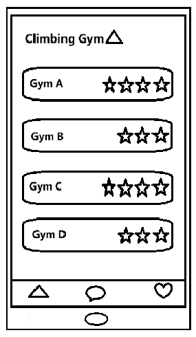
The "Crazy Eights"
Eight rapid hand-drawn UI sketches exploring different directions for ClimBuddy's core screens.
Design Alternatives
Each alternative maps directly to one user requirement — showing what we considered, what we chose, and why.
How to Surface Compatible Partners
Open lists shift the matching burden to the user and amplify social anxiety — scrolling through strangers' profiles feels evaluative and public. Swipe mechanics pre-qualify matches so every card shown is already relevant, reducing decision fatigue and making the interaction feel light and fun.
How to Present Gym Data
Freeform reviews are promotional-heavy and hard to compare. Fixed fields force gyms to supply exactly what climbers decide on — price, distance, environment — making each card immediately scannable and the overall discovery experience exploratory rather than exhaustive.
How to Close the Feedback Loop
A full AI trainer is technically unreliable and overwhelms beginners with volume. One targeted cue per session — aligned with motor-learning research — is more effective. Crucially, linking the AI response to a badge unlock closes the data→content→feedback loop users asked for, turning training into a progression system rather than isolated logging.
Image generated via doubao
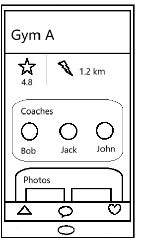
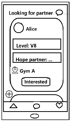
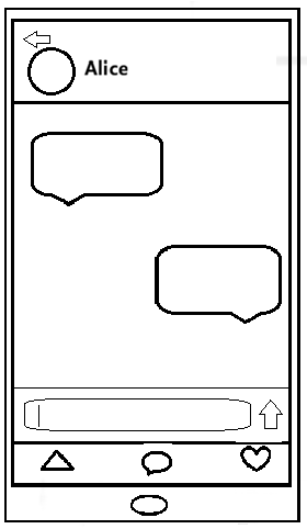
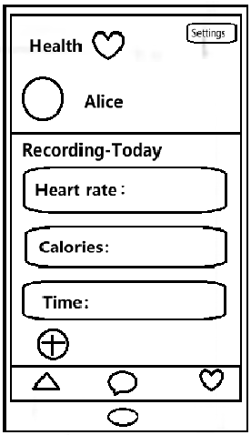
Low-Fi Prototype
Wireframe flowchart illustrating the core user journey — from partner discovery and gym browsing to coach booking and progress tracking. This low-fidelity blueprint guided our transition from concept to interactive design.
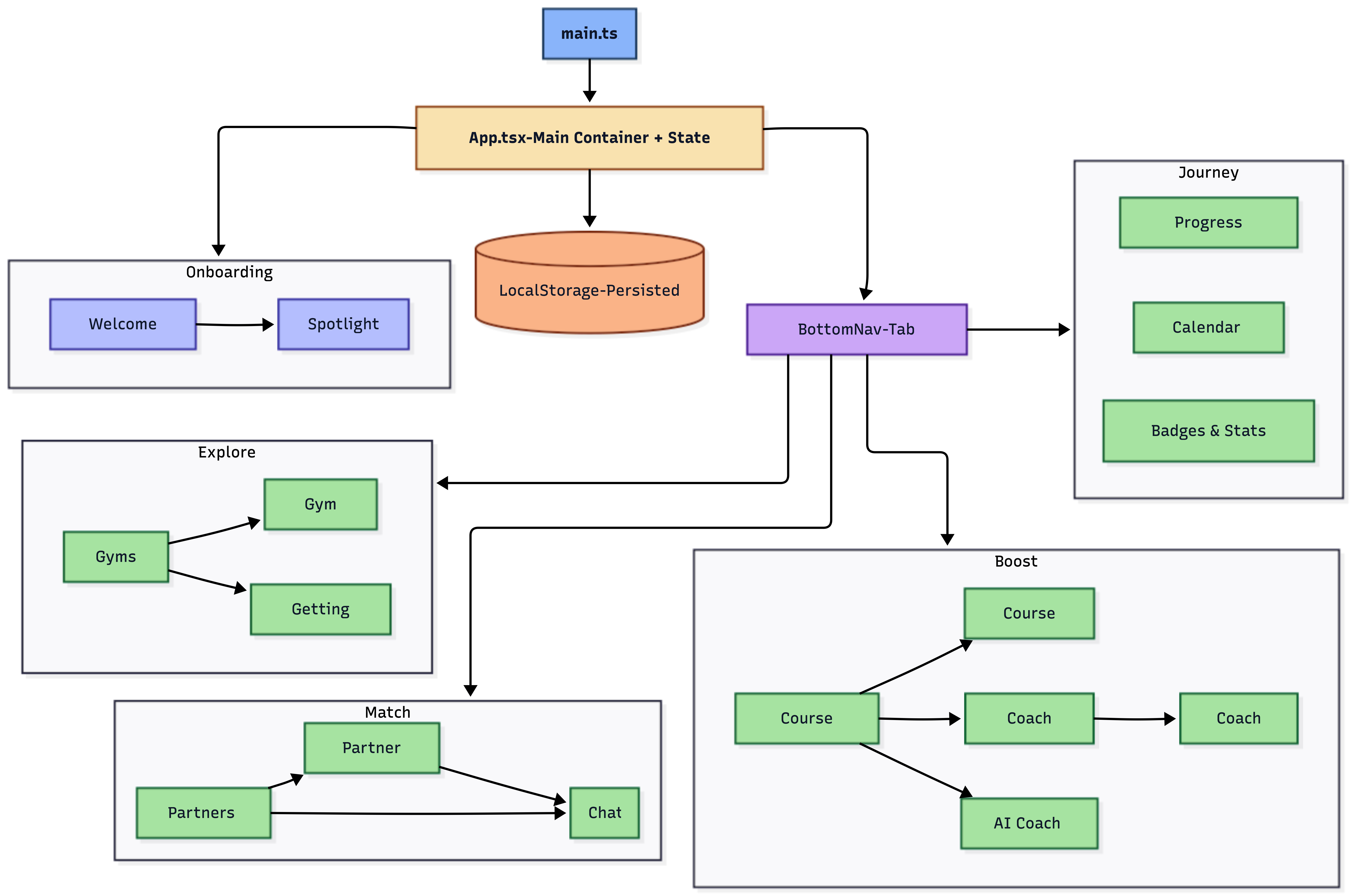
System Architecture
Architecture diagram illustrating the Climbuddy system design — showing how frontend interfaces, backend services, databases, and external APIs interact to deliver a seamless climbing experience across mobile and wearable platforms.
High-Fi Prototype
brmrs.github.io/Climbuddy
github.com/BRMRs/Climbuddy
Individual Contributions
Reflecting our collaborative approach, each team member contributed across all project phases with primary focus areas aligned to their strengths.
| Member | Code | UI Design | Content | Testing |
|---|---|---|---|---|
| Rui Zheng | 35% | 20% | 10% | 35% |
| Xinyi Xiao | 35% | 45% | 10% | 10% |
| Jiutian Chang | 15% | 15% | 40% | 30% |
| Zhixian Zhou | 15% | 20% | 40% | 25% |
Key Focus Areas: Rui & Xinyi led development and implementation; Xinyi drove visual and interaction design; Jiutian & Zhixian spearheaded user research, persona development, and content strategy. Testing responsibilities were distributed based on module ownership and availability.
Usability Testing
We conducted pilot testing with 6 users on the Alpha version of ClimBuddy, covering all four core modules. Below are results from three representative testers.
Tester 1
Female · University student · Complete beginner
Strengths Observed
- Found the swipe partner-matching intuitive and fun on first use
- Onboarding flow clearly explained app purpose within 2 screens
- Gym Directory filters (beginner-friendly, price range) met her main needs
Issues Found
- AI Coach responses felt generic — didn't adapt to her specific question
- Credit-score system needed a tooltip; she didn't understand it initially
Tester 2
Male · Working professional · Intermediate climber (~1 year)
Strengths Observed
- Progress tracking (V-level badges) was immediately motivating
- Coach booking flow was clear and logical — completed in under 3 taps
- Swipe filters (skill level, availability) gave him relevant matches quickly
Issues Found
- Main dashboard felt static — wanted more interactive feedback animations
- AI Coach suggestions were too basic for his intermediate level
Tester 3
Female · Part-time coach · Advanced climber (~2 years)
Strengths Observed
- Gym Directory with community ratings matched her expectations for quality info
- Appreciated the coach profile verification badge as a trust signal
- Video-upload feature for route review was well-placed in the journey flow
Issues Found
- AI Coach lacked depth — responses not intelligent enough for advanced users
- Some interactions (e.g., confirming a booking) had redundant confirmation screens
Aggregate Findings
Strengths
- Comprehensive core features well-received across all experience levels
- Clear, logical interface — users completed key flows without guidance
- Swipe matching and smart filters made partner discovery efficient and fun
- Gym directory and coach booking were praised for clarity and speed
- Gamified badge system created immediate motivation to engage further
Areas for Improvement
- Main dashboard needs richer micro-interactions to feel more "alive"
- AI Coach intelligence must be deepened — current responses are too surface-level
- Credit-score mechanic requires clearer in-app explanation for new users
- Reduce redundant confirmation steps in booking and matching flows
Iterative Refinement
Based on usability testing feedback, we refined three key screens to improve user experience. Below are the before/after comparisons showing specific improvements made.
1. Booking Screen — Time Restriction
Before
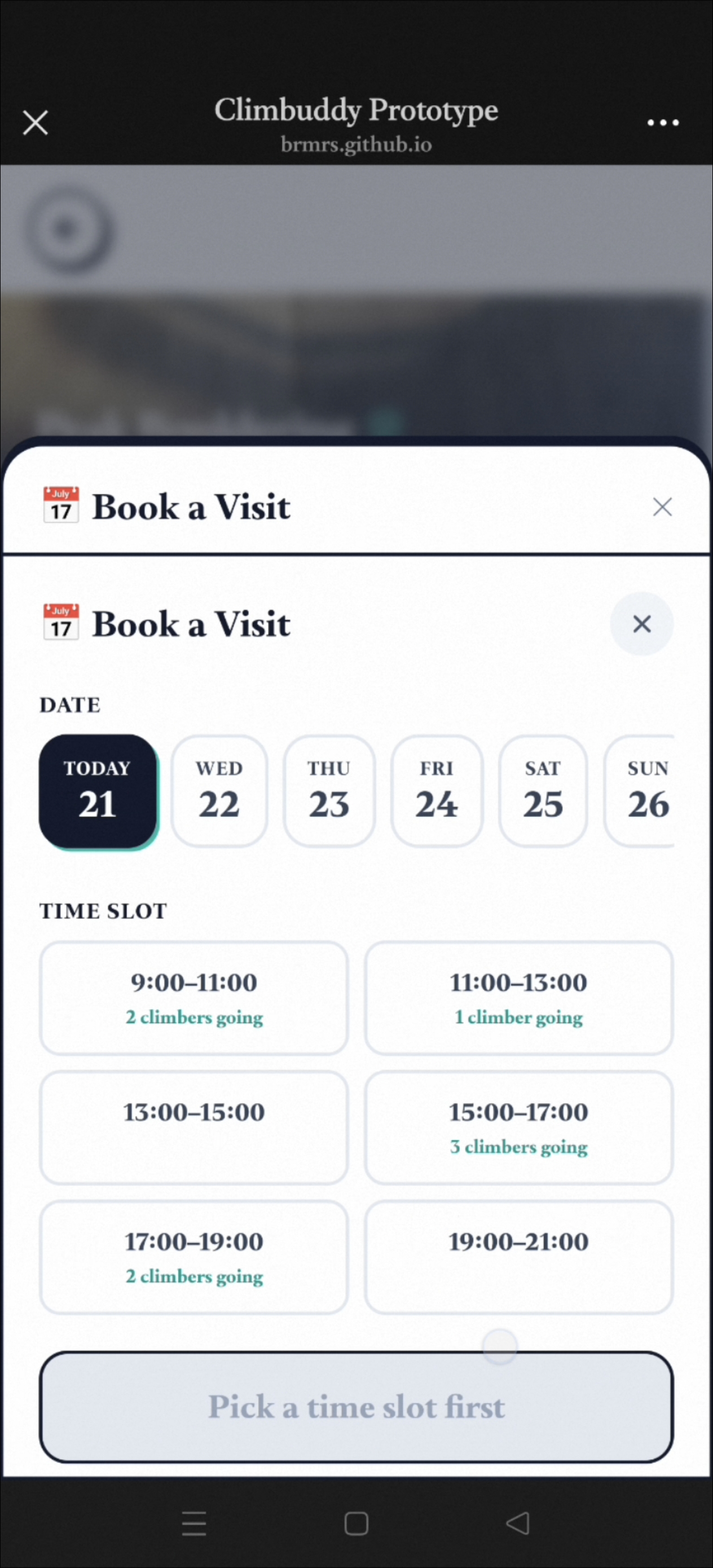
Issues Identified:
- All time slots displayed regardless of current time
- Users could accidentally select past time slots
- No visual distinction between available and unavailable times
- Caused confusion during booking flow
After
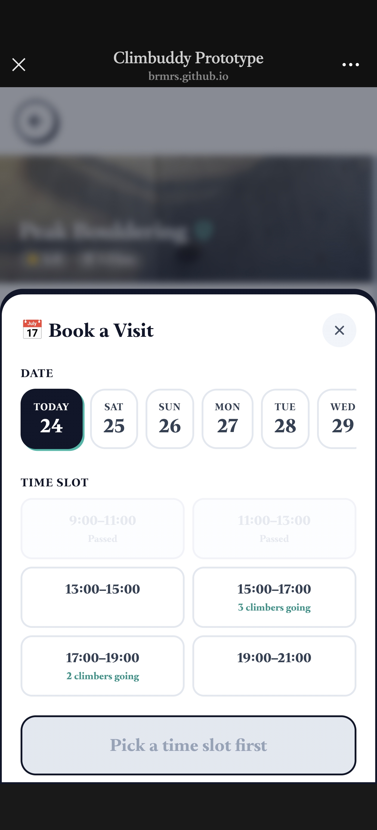
Improvements Made:
- Past time slots are visually blocked (grayed out)
- Current and future times remain selectable
- Clear visual hierarchy: blocked vs available times
- Reduced user errors and booking confusion
2. Matching Screen — Climbing Style Display
Before
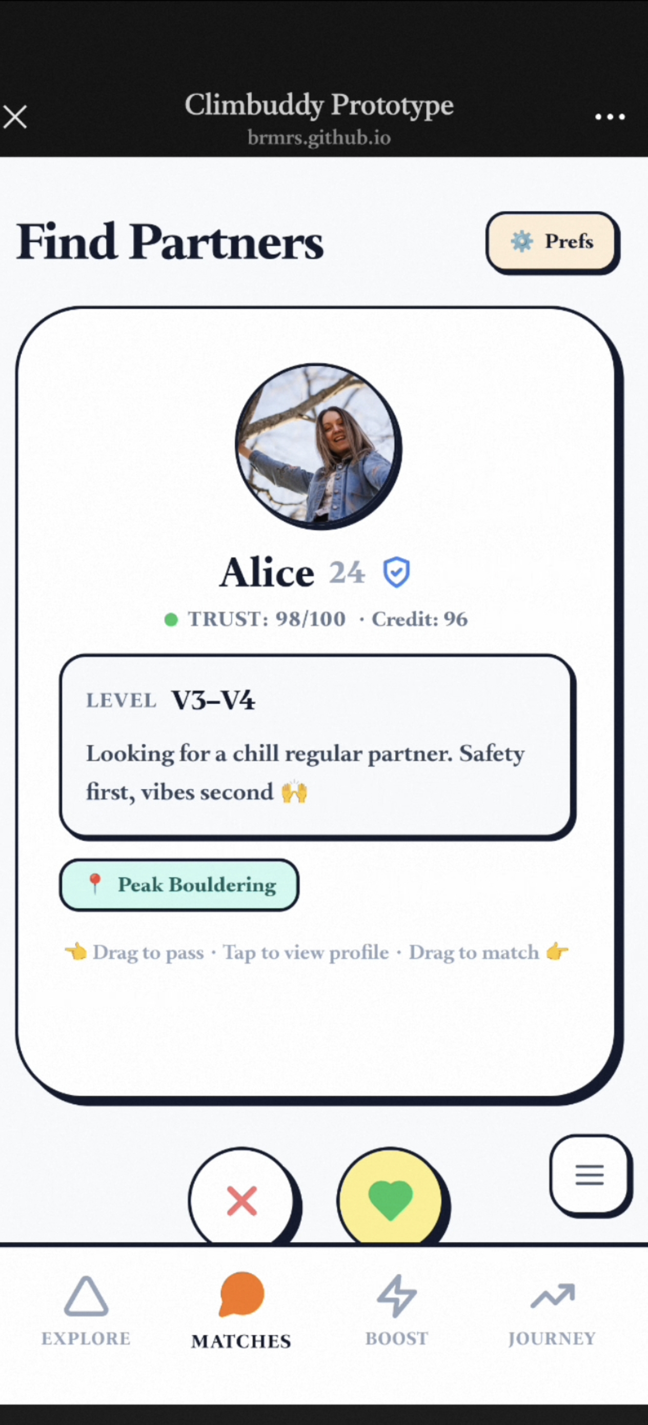
Issues Identified:
- No climbing style/preferences displayed on profile cards
- Users couldn't assess compatibility beyond basic info
- Missing key decision-making information
- Style mismatch was only discovered after matching
After
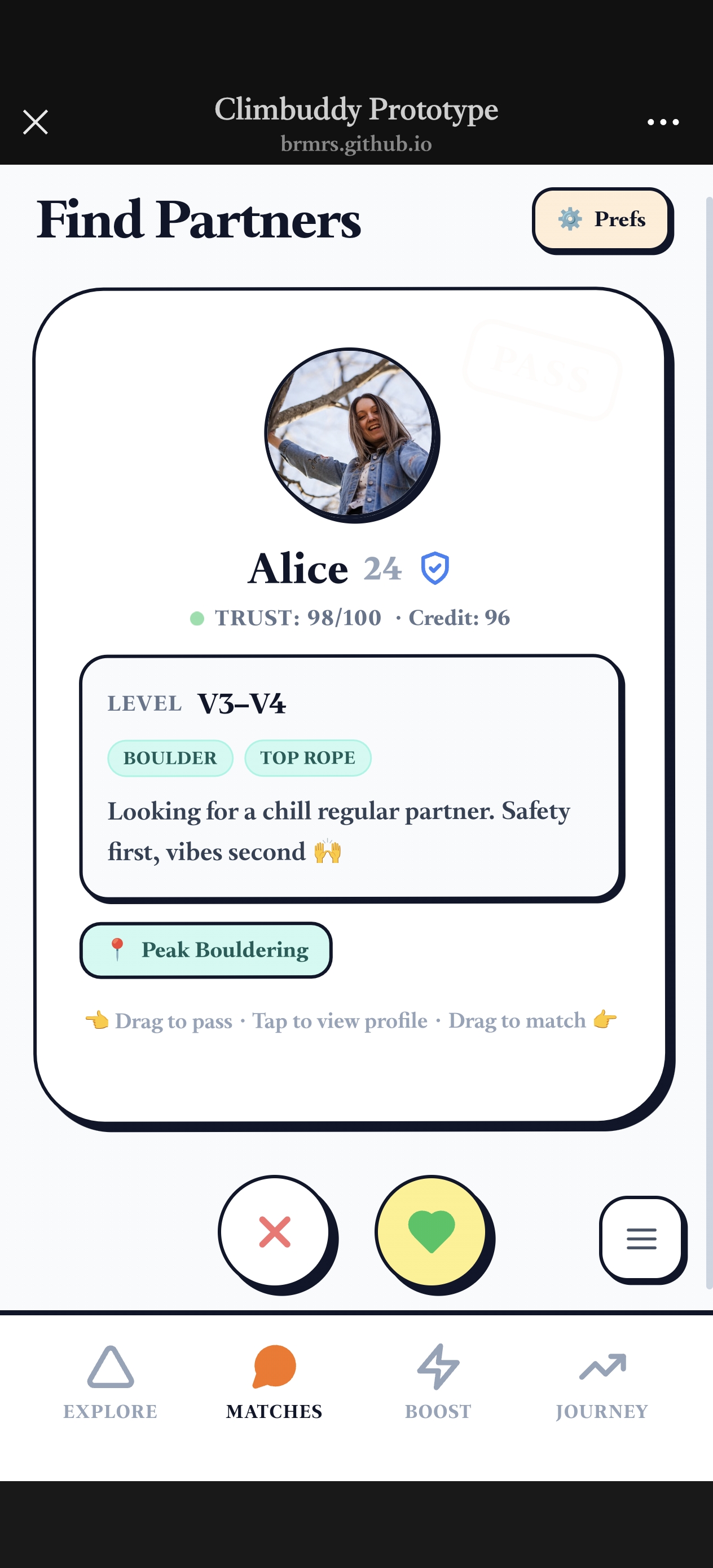
Improvements Made:
- Added climbing style badges/tags to each profile card
- Styles include: Boulder, Top Rope, Lead, Speed, etc.
- Visual badges make preferences immediately scannable
- Improved match quality by showing compatibility upfront
3. Journey Screen — Calendar Reordering
Before
Issues Identified:
- Stats and achievements dominated the screen
- Calendar widget was buried below the fold
- Users couldn't quickly see their climbing schedule
- Cluttered layout with competing visual elements
After
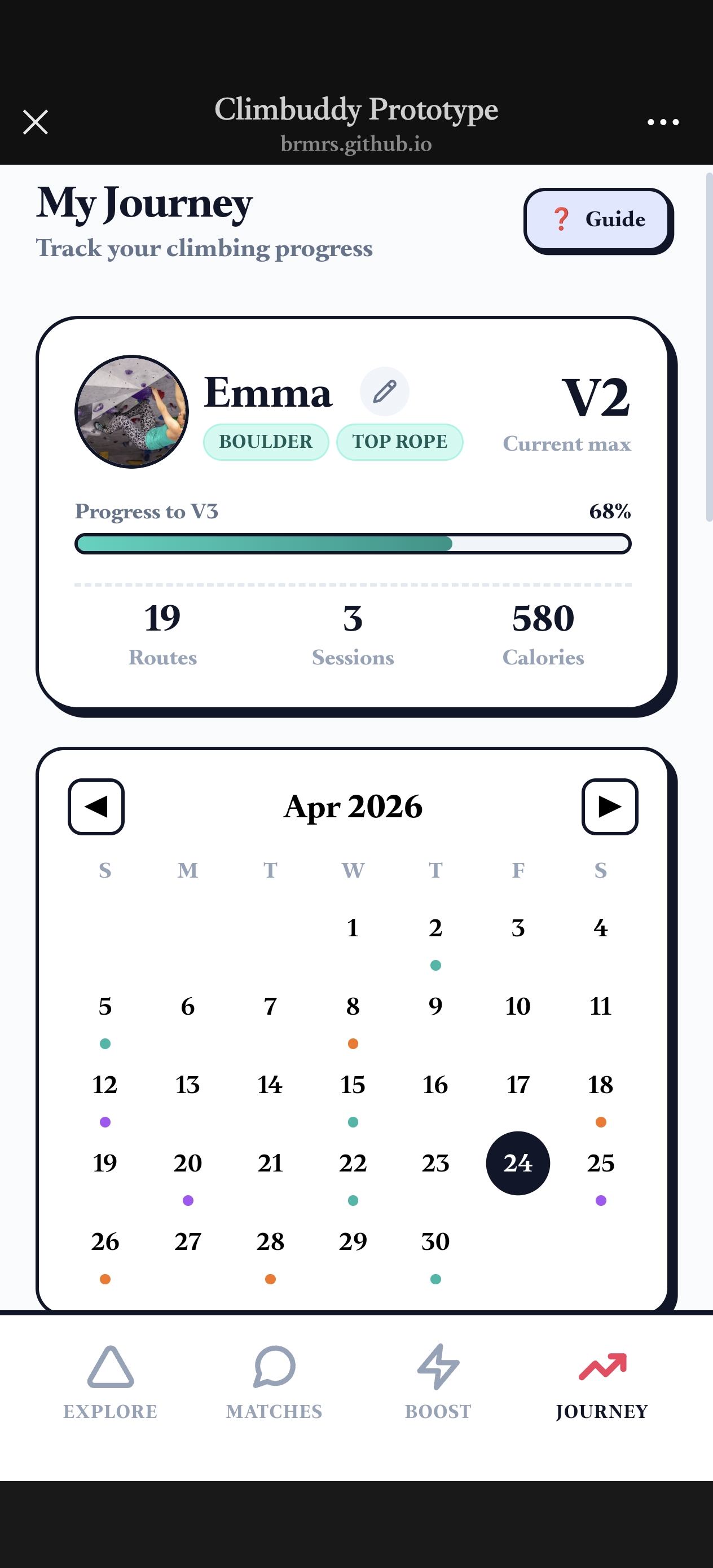
Improvements Made:
- Calendar widget moved to top of the screen
- Stats and achievements relocated below calendar
- Clear visual hierarchy: schedule first, then progress
- Users can now see upcoming sessions at a glance
Final Reflection
A critical discussion on the social and ethical implications of Climbuddy's design, and what we learned throughout this project.
Privacy & Data
Climbuddy collects location data, biometric wearable readings (heart rate, grip effort), climbing video footage, and interpersonal matching history. This is a particularly sensitive data profile: location traces reveal where users spend time regularly, and video uploads capture movement patterns that could be misused. We addressed this in our design by making all data uploads opt-in per session, storing wearable data locally first with explicit sync prompts, and not sharing video content outside the platform by default. In a production version, full GDPR/PIPL (China's Personal Information Protection Law) compliance reviews would be mandatory before any cloud sync of biometric or location data.
Fairness & Inclusion
The partner-matching algorithm filters by V-grade range, availability, and credit score. Left unchecked, users who climb infrequently — due to cost or schedule constraints — accrue lower credit scores and are surfaced less often, making the platform less useful for the users who need community support most. The AI Coach similarly risks being more accurate for users whose profiles resemble the training data. Climbuddy's prototype also depends on a smartphone and wearable device, and uses an English-first interface — all of which risk excluding users without smartwatches, older users, or non-English speakers. Going forward, we would conduct fairness audits on matching distribution, prioritise Chinese-first localisation, and ensure all core features remain functional without a wearable device.
AI Use in This Project
We used AI (Claude, Anthropic) for generating the portfolio website's HTML/CSS structure and the demo system's code scaffolding. All design decisions — user research methodology, persona development, feature prioritisation, and human-centric rationale — were produced by our team from primary data. We verified AI-generated code manually before integration, corrected errors the AI did not resolve autonomously, and reviewed outputs for basic accessibility compliance. We did not use AI to fabricate interview data, invent user quotes, or generate research findings. The distinction between AI as implementation tool and original team thinking as design foundation was maintained throughout the project.
Technical Reflection
Example 1: Coach Detail Page with Context-Aware Booking Logic
P (Prompt)
"我还要两个功能,我需要ai应该是一个沟通的对话框,你可以由boost界面进入,但是这应该是一个对话框,而不是一个只能上传视频的地方。并且现在是无法点击到教练详情页的,我觉得应该所有教练头像的地方应该都被允许点击教练详情页。详情页需要以下信息,教练常去的场馆,教练擅长的风格,教练的资质(雷达图),以及这个教练有发布过哪些教练课程。以及两个按钮,一个是和教练聊天的对话按钮,进入对话页面。一个是预定时间的页面。注意如果是在场馆界面直接点book教练的时间是不需要选场馆的,但是如果从boost界面book教练的时间是要选场馆的。"
English Translation:
"I need two more features. First, the AI should be a chat dialog accessible from the boost interface — a dialog, not just a place to upload videos. Currently, coach detail pages cannot be clicked into. I think all coach avatars should be clickable to access the coach detail page. The detail page needs the following information: the coach's frequently visited venues, the coach's preferred climbing styles, the coach's qualifications (radar chart), and the courses this coach has published. Also need two buttons: one chat button to enter the conversation page, and one booking button for scheduling time. Note: If booking from the venue interface, venue selection should be skipped. But if booking from the boost interface, venue selection is required."
O (Outcome)
Status: ✅ Success (with one omission)
The AI successfully generated the complete Coach Detail Page, including coach information, frequently visited venues, climbing style tags, qualification radar chart, published course list, and both the chat and booking buttons. The context-aware booking logic was correctly implemented on the first attempt — entering from the venue interface skips venue selection, while entering from the boost interface requires it. All coach avatar entry points were correctly made clickable.
However, the AI did not account for the loading state of the chat dialog. When the dialog first opens, there is a brief moment before content renders, and the AI left this state entirely unhandled — no placeholder or skeleton screen was generated. This was a minor but noticeable edge case identified during real device testing.
A (Action)
Because the core logic and structure were correct, the AI-generated code was integrated directly without modifying any functional logic. Sample data was added for 3 coaches, and button colors were adjusted from default blue to the project's climbing orange (#FF6B35) to match the visual style — a purely cosmetic change.
The one gap identified in O — the missing loading state for the chat dialog — was handled manually. I added a skeleton screen loading state independently, without re-prompting the AI, as it was a small and well-defined addition that was faster to write directly than to re-enter into a new prompt cycle.
Example 2: Badge Time Display, Fixed Modal Positioning & Calendar Feature
P (Prompt)
"我希望你帮我增添这些功能:在点开展示具体badge的时候展示获得badge的time;调整增加sessions的效果;ai分析和视频上传应该拆分为两个,上传session的时候应该提供上传video的选项,并且为再查看历史session的时候应该允许我查看附带的video;在底部目录增加付费增值项目,提供关于攀岩更深层教学知识的渠道,如何有效拉伸这种视频课程都应该是免费可以看的,但是比如说现在攀岩的用户到了平台期缺乏某块具体肌群锻炼的课程,这是要专门付费的;把找教练功能融入付费增值项目里,并且教练可以通过上架自己的课程来引流;看到journey页面的AI分析广告,点进去之后跳转到付费增值的课程页面。根据AI的计划,上每日的线上课程(如果买了教练课,AI则将教练课包含进计划);需要新增场馆评价页面;在新手教程结束的灰色小字那里可以放一个know more然后跳转到课程页面;journey页面需要增加一个我自己的calendar,用于标记我自己那天预约了哪个场馆。或者我哪天要和谁一起去哪个场馆。这个应该安排在badges的上面;现在journey页面的弹窗(例如某个具体的badge,或者录入session信息都不固定,不符合正常显示习惯。我希望这些弹窗都能够固定显示在底部目录栏上方,而不是会受我滑动屏幕才能看完整的内容。"
English Translation:
"I want you to add the following features: When expanding a specific badge, display the time when the badge was earned; Adjust and improve the session addition effect; Split AI analysis and video upload into two separate features — when uploading a session, provide a video upload option, and when viewing past sessions, allow viewing of attached videos; Add a premium paid feature to the bottom navigation bar, providing access to deeper climbing knowledge — free videos such as stretching tutorials should remain free, but specialized courses for climbers in a plateau phase lacking specific muscle group training should be paid; Integrate the Find Coach feature into the premium section, allowing coaches to list their courses for customer acquisition; When clicking the AI analysis ad on the journey page, navigate to the premium course page, and take daily online courses based on AI plans (if coach courses are purchased, AI should incorporate them into the plan); Add a venue review page; Add a Know More link next to the gray small text at the end of the tutorial, navigating to the course page; Add a calendar to the journey page above badges for marking which venue I booked on which day, or who I'm going with and to which venue; Currently, modals on the journey page are not fixed — I want them fixed above the bottom navigation bar, not requiring scrolling to see the full content."
O (Outcome)
Status: ⚠️ Partially Buggy (Modal Positioning)
The AI successfully generated most features, including badge timestamp display, session enhancements, video upload integration, premium course section, coach listing integration, AI ad navigation, venue review page, tutorial Know More link, and the calendar component. However, the fixed modal positioning — one of the most critical requirements — required multiple rounds of iteration before working correctly:
- First generation: Clicking a badge triggered two separate modals instead of one consolidated one, which was not the intended behavior.
- After first fix: The modal consolidated correctly, but it was positioned relative to the page center rather than the phone container, causing the bottom tab bar to occasionally overlap the modal content — an unacceptable UX issue.
- After second fix: The modal moved closer to the bottom, but an unexpected gray overlay layer appeared beneath it, and the modal still didn't sit flush enough against the tab bar.
- After third fix: Modals across the journey page (log session, badge detail) had a visible gap between the modal bottom and the tab bar. Additionally, the "My Journey" heading at the top of the page had disappeared entirely — a regression introduced during the fixes.
A (Action)
Because the modal positioning went through multiple failed iterations, I did not directly integrate the AI output each time. Instead, I adopted a confirm-before-execute workflow: each time I submitted a new requirement, I first asked the AI to explain its understanding before making any changes, then confirmed before it proceeded — this prevented repeated misunderstandings from compounding.
When the "My Journey" heading disappeared as a regression, rather than asking the AI to fix it blindly, I asked it to diagnose the root cause first. The AI identified three possible causes; I tested each one manually and discovered the issue myself: the AI had set absolute inset-x-0 bottom-[80px], but the correct value was simply absolute inset-x-0 bottom — a hardcoded offset that conflicted with the actual layout. I corrected this value directly in the code without re-prompting the AI.
The final working modal implementation was therefore a combination of AI-generated structure and my own manual correction of the positioning value.
This website was built with the assistance of Claude (Anthropic) for technical implementation. The AI was used solely for generating HTML/CSS code structure, layout design, and deployment configuration.
Human-centric design logic: All core design decisions—including user research findings, persona development, feature prioritization, and product motivation—were defined by the team members. The human-centric design framework that drives Climbuddy was original team work.
Verification methods: All generated code was reviewed for correctness, tested for responsive behavior across multiple viewport sizes, and checked for compliance with GitHub Pages requirements (relative paths, .nojekyll file, no build dependencies).
Ethical considerations: We reviewed AI-generated code for basic accessibility compliance, including colour contrast ratios and touch target sizes suitable for mobile users. We also recognised that the AI-generated coach display logic could introduce visibility bias if scaled beyond our manually curated sample data — a limitation we would address with fairness-aware ranking in a production version.
References
Academic Papers
- S. O'Mara and M. S. Mahmud, "Addressing grading bias in rock climbing: Machine and deep learning approaches," Frontiers in Sports and Active Living, vol. 7, Art. no. 1512610, Jan. 2025.
- M. Yan et al., "ClimbingCap: Multi-modal dataset method for rock climbing in world coordinate," in Proc. IEEE/CVF Conf. Computer Vision and Pattern Recognition (CVPR), 2025, pp. 12312–12323.
- L. Sun, Y. Zheng, Q. Jiang, X. Shi, M. Romero, and R. Guerese, "Sound-assisted climbing: Exploring bouldering performance through auditory guidance," in Proc. SportsHCI 2025: Annu. Conf. Human-Computer Interaction and Sports, Enschede, Netherlands, Nov. 2025, pp. 1–8, doi: 10.1145/3749383.3749402.
- C. Lister, J. H. West, B. Cannon, T. Sax, and D. Brodegard, "Just a fad? Gamification in health and fitness apps," JMIR Serious Games, vol. 2, no. 2, p. e9, 2014.
AI Tools Used
- Claude (Anthropic). Claude Sonnet 4.5, Claude Opus 4.6, Claude Sonnet 4. Used for generating the website HTML/CSS and demo system code structure, layout design, and content organization. Accessed March–April 2026.
- Doubao (ByteDance). Doubao Client. Used for generating user persona profile images (Emma Chen and Marcus Li). Accessed March 2026.